This anticipatory preview captures the excitement surrounding Twitter's major interface redesign announcement in September 2010, as Patrick Bisch reacts to the news that Twitter's aging web interface would finally get the update it desperately needed. Writing from a live event, the author expresses relief that Twitter was addressing what many users saw as a growing gap between the platform's innovative mobile and desktop apps and its outdated website.
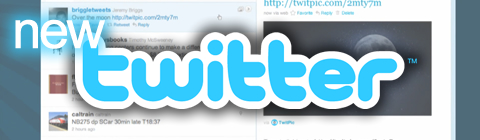
The post provides detailed coverage of the announced changes, most notably the introduction of a two-column layout similar to Twitter's recently released iPad app. The left column would display the traditional tweet feed, while the right column would show dynamic content like YouTube videos, Twitpics, Google Maps, and other media from 16 partner services. This represented a important shift toward making Twitter more visual and interactive, reducing the need for users to click away from the platform to view shared content.
Bisch highlights several key features that excited users at the time: Mini Profiles that would pop up when clicking usernames, integrated media viewing, and the promise of less clicking overall. He also mentions his hope for Twitter's t.co URL shortener connection, showing how even basic features we take for granted today were important innovations back then. The author wisely tempers expectations by noting he hasn't yet experienced the interface firsthand and promises to update readers once he gains access.
This post documents a crucial moment in Twitter's evolution from a simple text-based microblogging platform to the multimedia-rich social network we know today. The author's references to user backlash against Digg's redesign and Facebook's interface changes provide valuable context about how sensitive social media users were to platform changes in 2010. Reading this 15 years later, it's fascinating to see how this "facelift" laid the groundwork for features that became standard across all social media platforms, while also showing how the concept of a major interface redesign was still relatively novel in the social media world.
This summary was created by Dave Rogers. The original post was written by Patrick Bisch and published on September 1, 2010.
If you'd like to view the original post, you can find it here.