This complete coverage documents Gmail's major interface overhaul that transitioned from the experimental "Preview" theme to a completely redesigned email experience. Patrick Bisch examines how Google spent months testing this new interface through the Preview theme option before making it the standard Gmail experience, representing one of the most important visual updates to the service since its 2004 launch. The timing coincides with what the author calls "Gmail Day," referencing simultaneous rumors about a native iPhone app and this interface update.
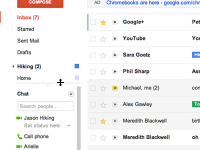
The analysis details three major improvements that modernized Gmail's aging interface. The updated themes system finally replaced outdated visual options with contemporary color schemes and high-definition photography from iStockphoto partnerships, bringing Gmail's aesthetics in line with modern web design standards. The revamped sidebar introduced intelligent organization by automatically hiding Labs features and providing adaptive visibility for labels and Google Chat, streamlining the interface without losing features. The conversation view received a complete makeover with profile picture connection, message snippets, and repositioned action buttons that bore striking resemblance to Google+ conversations, highlighting Google's push for visual consistency across their ecosystem.
The post provides practical addation guidance, including instructions for accessing the new interface immediately rather than waiting for the gradual rollout by closing chats and tasks before refreshing Gmail. Bisch notes Google's strategic approach of testing major changes through optional themes before full deployment, demonstrating careful user experience management during important interface transitions. The coverage emphasizes how these changes represented Gmail's evolution from a simple email service toward a more sophisticated communication platform.
This interface update captures Gmail's transition from its utilitarian origins toward the modern email experience we recognize today, establishing design patterns that influenced webmail services industry-wide. Looking back 13+ years later, this redesign proved to be the foundation for Gmail's current interface, with many elements like profile picture connection, adaptive sidebars, and conversation threading becoming standard email features. The resemblance to Google+ conversations documented here reflects Google's broader effort to unify their services' visual language, a strategy that continued through Material Design and beyond. While Google+ itself eventually failed, its design influence on Gmail and other Google services proved lasting and successful. The careful rollout strategy described in this post became a template for major interface changes, with tech companies now routinely using preview programs and gradual deployments to manage user adaptation to important design updates. Most importantly, this redesign marked Gmail's transformation from a basic email service into the complete communication hub that billions of users rely on today.
This summary was created by Dave Rogers. The original post was written by Patrick Bisch and published on November 1, 2011.
If you'd like to view the original post, you can find it here.